Problems with Leeds Buses - An Actual Analysis
Abstract
It's common knowledge that Leeds buses are bad, both in terms of frequency but perhaps more importantly, accuracy. Everyone has an anecdotal horror story of being late, missing connecting trains, buses, you name it. However, as yet, a robust statistical analysis has not been performed.
I present a brief analysis of the number 72 bus from Leeds - Bradford, a central commuter line for the Leeds - Bradford area, and the number 6 bus from Holt Park - Leeds, a major student commuter line to the universities. I show that the live times displayed on the digital bus timetables are systematically incorrect, and that the inaccuracies are non-trivial and cannot be explained by traffic conditions. The inaccuracies are also qualitatively independent of both route and time period, suggesting either woefully unsuitable measuring tools and predictive algorithms, or purposeful misinformation. I conclude by suggesting ways that Metro, First, Arriva and the West Yorkshire councils can resolve these issues.
Introduction
Buses are a vital part of the Leeds (and West Yorkshire) transport network. In the absence of trams (which have dedicated tracks and thus, fewer problems), buses are what we need to better optimise travel around the Leeds area, and to get more cars off of the local roads to protect our environment. To do this the bus service must be reliable, and currently, it simply isn't.
The Leeds bus network has been plagued with problems for many years now. The companies that serve us, notably First (West Yorkshire) and Arriva, are always talking about frequency and regularity1. However, many people I speak to as I wait for buses do not complain about the frequency or regularity. Instead, I often hear that "they never turn up" or "they're always late". In other words, timetable accuracy is more important than anything else. People generally make plans for their days, and those plans require accurate travel information to work around. Irregular, or even fewer, buses do not matter as much as being able to time my plans around an accurate bus timetable. I do not want to spend more time than I have to waiting at bus stops, literally wasting my time2.
This report will present an analysis of live bus timetable accuracy in the Leeds area using two stops on routes as examples, both operated by First West Yorkshire. The first route, the 72 bus from Bradford-Leeds stopping at Stanningley Lidl (Stop Number 45010878). This is a major commuter route and thus we might hypothesise it to be busier during rush hour. The second route, the 6 bus from Holt Park-Leeds stopping at Leeds University (D) (Stop Number 45011385). This is a major student commuter route through Headingley, although at the time of measurement, students are away from universities. To clarify, “live bus timetables” are those presented either online or digitally at bus stops which display how long away the next few buses are, and update at regular (1 minute) intervals. As we will see, these “live” timetables are systematically wrong and hence misleading to the public.
1First recently advertised that they have buses arriving every 15 minutes or better, which is an interesting brag seeing as it was every 10 minutes a few years ago.
2A partner of mine and I joked that much of our relationship was based around waiting for buses. While she wasn't wrong, I feel our relationship would've been even more fulfilling if we spent time together at home, not at bus stops.
Methods
All live bus arrival time data was scraped from http://yorkshire.acisconnect.com/Text/WebDisplay.asp which, upon investigation, is the server from which Metro (https://www.wymetro.com/buses/your-next-bus/) and the live bus timetable boards at bus stops get their up-to-date information. The data was scraped using an automated Python script, continuously running for a period of two weeks per stop and taking a measurement every minute for a single stop. If I attempted to scrape any more data from a single IP address (i.e. additional routes or stops), I would be timed out, making a full study of the entire network impossible for an individual without explicit authorisation from Metro. For the 72 bus at stop 45010878 (Stanningly Lidl), data was collected between 15/05/2022 and 29/05/2022. For the 6 bus at stop 45011385 (Leeds University D), data was collected between 29/07/2022 and 12/08/2022. As these buses are separated both in space and time, i.e. by route and by time period of data collection, any systematic problems occurring cannot be attributed to the route or stop itself, or something uniquely wrong with that particular date/time. Rather, it would be indicative of a problem across the entire network.
Occasionally, if a bus cannot send its live time to the server, the expected (immutable, hand-written) timetable time appears on the board instead. These buses were not considered, as these times have no empirical basis at all and due to their static nature, cannot take into account traffic conditions, weather, number of passengers etc. Cancelled buses are also not considered as these appear to be related to a different problem, perhaps staffing issues. All data was organised and manually verified for consistency before analysis using further scripts. No scripts used in this work will be released publicly, but will be made available to anyone who wishes to verify the findings.
Finally, throughout this study we have assumed that if a live timetabled bus gets down to the “Due” status and then disappears from the board, this bus arrived successfully. Anecdotal evidence suggests that while this is mostly the case (thus justifying our analysis), it is not always so.
Results
Bus dwell times for the 72 bus become systematically incorrect as the bus gets closer
Figure 1 shows the expected dwell times for a the 72 bus at different types and times of day. The dwell time is defined as follows: if the time displayed on the live time table is "X minutes", then the dwell time associated with "X minutes" is how many actual minutes pass while that time remains on the board. Just a quick description of the graphs; each coloured line shows the mean (average) time that each live time will remain on the board. However, because we have discrete data (the live times on the board are refreshed exactly every minute) and the data is not normally distributed, it is inappropriate to add Gaussian standard deviations to the graphs to show the variation around the mean. Instead, I have chosen to display a “violin plot” at each data point, which shows the approximate distribution of contributions to the mean data point. In Figure 1a, these violin plots correspond to the “All” data set, and in Figure 1b, they correspond to the “Afternoon” data set. So, for example, if the live time displayed is 5 minutes on any day (blue line in Figure 1a), the live time has a high density of 1 minute time spents, 2 minute time spents, and a small number of 3 minute time spents. As such, the mean is around 1.5 minute time spents.
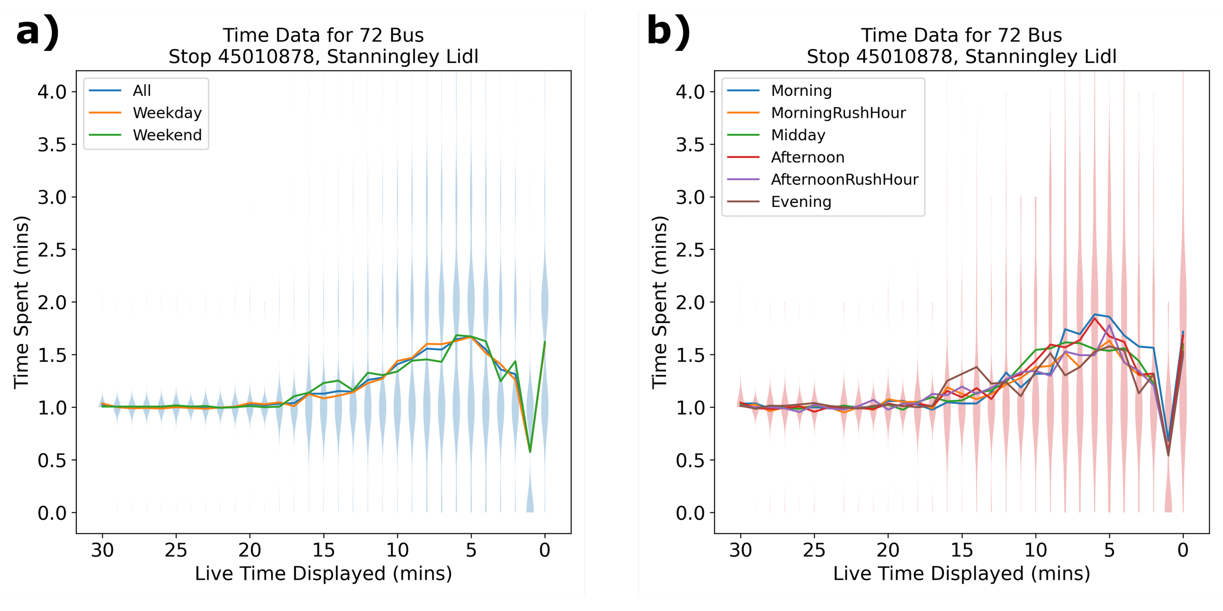
Figure 1: The expected dwell times (time spent in each live time) for the number 72 buses on different types of day. a) Different types of day. b) Different day segments.
If the live timetables were accurate, then we would expect the mean dwell time to be 1 minute at all times with a small amount of variation, as any time displayed on the board should only be there for a single minute on average. However, as we can see from both Figure 1a and Figure 1b, as the bus gets closer, the dwell time increases significantly from the expected 1 minute to a maximum of around 1.5 minutes, a 50% increase. Strangely, we see that the variation in the dwell time also greatly increases as the bus gets closer, and quite abruptly. In other words, in all cases when the bus live time is displayed as more than than 20 minutes away, the dwell time is always 1 minute with few exceptions. From a live time of 10-20 minutes away, a few inaccuracies creep in, and from a live time of 10 minutes away until the bus arrives, we see that errors are almost as common as correct predictions. Even more simply put, note that if the live time displays 5 minutes, it is almost equally likely to display 5 minutes for 1 minutes as it is to display it for 2 minutes. The additional parts of the violin plot show that it may also display 5 minutes for up to 3 minutes.
In Figure 1b we can see the same qualitative pattern as in Figure 1a. We do see that the issue is exacerbated at busy times (Afternoon and Afternoon Rush Hour), but that the problem persists throughout suggests that neither the type of day or time of day affects these inaccuracies, suggesting that it cannot be attributed to traffic conditions or number of passengers.
As a final point, the dwell time value at 1 minute drops significantly. For anyone who pays attention to these things, live bus times tend to completely miss out "1 minute" most of the time, and instead simply say "Due" instead. I am unsure what metric is used by Metro as to whether to display “1 minute” or “Due” on the board, but it is confusing.
The expected wait time for the 72 is, in all cases, higher than the displayed live arrival time
A dwell time of 1.5 minutes instead of 1 minute may seem insignificant, but those dwell times add up as a passenger waits at a bus stop. Figure 2 shows the total time we can expect to wait at each live time displayed.
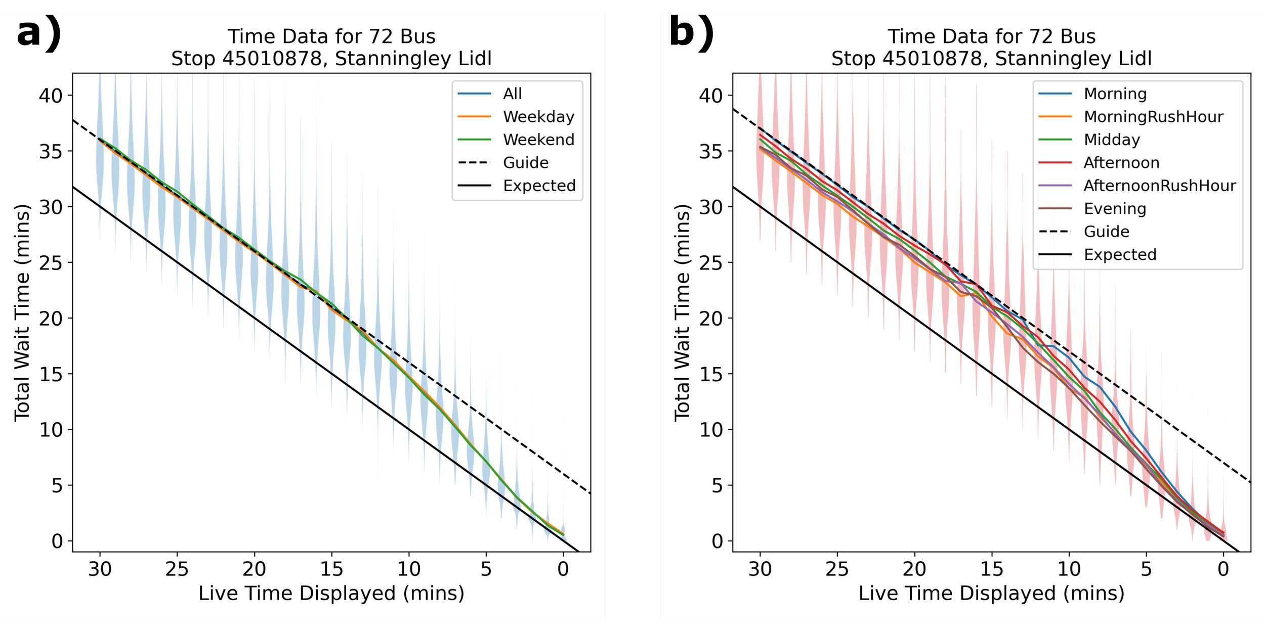
Figure 2: The expected total wait times (total time spent waiting for the number 72 buses to arrive from each live time) for buses on different types of day. Black line shows the ideal pattern of wait time vs actual time, and black dashed line shows the same gradient, but with a constant offset as a guide for the eye. a) Different types of day. b) Different day segments.
We see that in all cases, the total measured wait time (the time you can expect to wait in total for a bus to arrive) is greater than the live time displayed. Considering the graph in reverse (beginning from zero on the x-axis), we see that the more time is added to the live time, the more incorrect the live time becomes. When the live time displays anything greater than 10 minutes, we can expect to wait at least an extra 5 minutes, and up to as much as 7 or 8 minutes in the worst case. When the live time displays “Due”, we can be expected to wait around 1 extra minute. When the live time displays 5 minutes, we can be expected to wait around 2 or 3 extra minutes.
Of most importance is that using the guide for the eye (Equation: y = -x + offset), we can see the systematic error from the ideal expected graph (Equation: y = -x) is greater than any variation due to time or type of day, again indicating that the prediction errors in the live timetabling cannot be blamed on traffic conditions. In fact, it is itself worse than any problems caused by traffic conditions.
The 6 bus shows the same qualitative issues as the 72, but the dwell time distribution is sharper
Figure 3 shows the dwell time data for the number 6 bus, and Figure 4 shows the wait time data for the number 6 bus. We can see that the same qualitative pattern occurs as with the number 72, but significantly worse because the errors are greater and localised around the lower bus arrival times, the time when more customers will be waiting at a bus stop.

Figure 3: The expected dwell times (time spent in each live time) for the number 6 buses on different types of day. a) Different types of day. b) Different day segments.

Figure 4: The expected total wait times (total time spent waiting for the number 6 buses to arrive from each live time) for buses on different types of day. Black line shows the ideal pattern of wait time vs actual time, and black dashed line shows the same gradient, but with a constant offset as a guide for the eye. a) Different types of day. b) Different day segments.
The distribution of dwell times is much sharper, with most issues occurring when the live time displays less than 5 minutes. Considering Figure 3a, we see that if the live time displays “2 minutes”, we can expect the live time to remain at “2 minutes” for an average of around 3 minutes, so long that it is longer than the time displayed for the bus to actually arrive. We can see from Figure 3b that although this error is of greatest issue at busy times, it is still significant at any time of day, and on any day.
Of course, these additional dwell times add up, and we can see in Figure 4 that even at small times, the live time displayed for the number 6 bus is never accurate, always taking at least 1-2 more minutes to arrive than the displayed live time claims.
Interestingly, the overall error in wait time at large times is roughly equivalent for the 6 bus as for the 72. This is because while the dwell time for the number 6 distribution reaches a much higher error, the overall error is sharper and more localised.
Conclusions
We have seen a systematic error in dwell time in both the number 72 and number 6 buses, which propagate into large systematic errors in the total wait times for basically any time displayed on the “live” timetable boards, reaching a maximum error of around 4-6 minutes if the bus is predicted to be 5 or more minutes away. We also see that while there is little difference between weekends and weekdays in either bus, there are larger differences between different times each day. For both the 6 and 72, we see an increase in dwell times at times when the traffic is busy (afternoon rush hour), and this is worse in the number 6 bus. However, because there is a systematic error at all times, including low traffic times, traffic conditions cannot be the root cause of the problem. Nevertheless, for people who take an average of two buses a day, we can estimate they lose around 10 minutes per day waiting for incorrectly timetabled buses. This adds up to about an hour a week, and this is without even including cancelled buses.
Let's consider what the causes of this error may be. Again, I stress that because the number 6 and 72 buses are separated in space, and the data collection itself and the segments measured in each day were separated in time, we can safely say that these systematic errors cannot be attributed to either the routes or the specific times. Rather, this is an error in the predictive mechanisms used by Metro and First across the bus network. The fact that all the error is localised to when the bus is closer is extremely interesting, as one would expect error to be equally distributed across the entire route, or grow slowly as the bus approaches busy areas. It may be the case that the issue is localised to these two specific stops, but given the space-time separation, I highly doubt it. I initially hypothesised that a constant dwell time value was used by Metro to predicted wait time per bus stop (i.e. assume 1 minute per stop), and that this value was simply incorrect. However, if this were the case, the error would be equally spread over the entire 30 minute period. The same would be true if each stop had a constant but unique dwell time to be used for predictions. We must consider that below 10-15 minutes, when the dwell time begins to increase, a different mechanism is used by Metro to predict arrival times. Unfortunately, it has to be stated for completeness that this could suggest intentional errors and misinformation. As a customer, I will always be more likely to wait for a bus, or set off/run for a bus, if it appears to be closer. If it appears to be a longer time to wait, I might consider walking instead, and indeed, the data shows that the bus is always claimed to be closer than it truly is by the live timetables. However, I do not believe these errors to be intentional. A famous adage called Hanlon's Razor says: “Never ascribe to malice that which is adequately explained by incompetence”, so I will assume it is simply an error, albeit a severe one.
In any case, such errors are inexcusable in the age of machine learning and big data analysis. Using exactly the same data scraping and analysis methods I have used here, live times could be accurately predicted / adjusted based on previously measured arrival times. Doing this could only be a benefit to everyone involved: customers, as they would be able to accurately predict buses and plan their day around it, and bus companies, as they would reduce their negative press and their drivers would be treated better.
I conclude by strongly suggesting that the Mayor of West Yorkshire and other local politicians take actions to address the issues raised in this report. If they seriously care about the local bus services, as they publicly claim to right now (https://www.yourvoice.westyorks-ca.gov.uk/bigbuschat), then they should use mature data analysis methods and machine learning to make quick changes that benefit people. Bus frequency cannot be increased without either creating more council-run services, or subsiding First and Arriva to run services they otherwise wouldn't and that'll cost a fortune. Cleanliness is already passable, and to do anything else would require large-scale societal change (i.e. make local people respect their bus services). But properly predicting bus arrival times? That can be done by a single contracted data scientist in about 6 months, and would massively increase our quality of life as commuters. So do it!
Update - 29/08/2022
After chatting with a some people, I quickly did some extra graphs to look at just how many buses are late. Because the timings are inaccurate, the number that are late change as the bus gets closer. But I can show, in Figure 5, that the number of buses that are late if it say “5 minutes” on the live timetable board is…embarrassing.
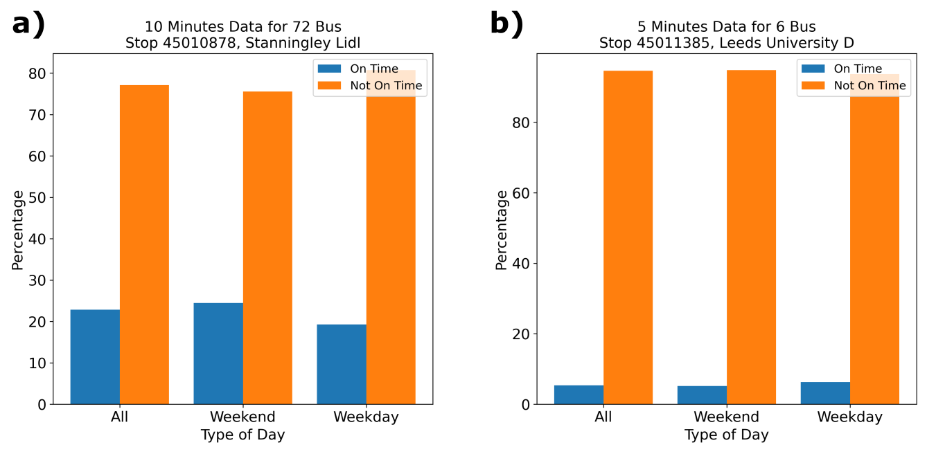
Figure 5: The number of buses that were measured as late when “5 minutes” was displayed on the live timetable board. a) 72 bus. b) 6 bus.
Update - 31/08/2022
There’s an actual newspaper article about it now :o
Update - 03/09/2022
There is a BBC Yorkshire article on it! Crazy stuff, clearly I’ve hit a collective nerve here.
https://www.bbc.co.uk/news/uk-england-leeds-62767319